Savvy online shoppers looking for fashion options, fit and value from an existing brand website.
To provide customers with a quick and easy search for a clothing item, checkout and delivery options with a mid-fidelity prototype.
User Research, information architecture, interaction design, branding, and UI Design.
User Interviews
Persona
Empathy Map
Storyboard
Card sorting
Sitemap
User flow
Task flow
Responsive wireframes
Prototypes
Logo design
Key website screens
Style tile
UI Kit
Usability testing
Affinity map
Mirror is a global chain with over 400 stores in 32 countries providing customers with quality fashion at affordable prices. The website has been long neglected and urgently needs a refresh and update to meet current user needs. This redesign is critical to Mirror’s future success. The site must be competitive with other retail websites like Uniqlo, H&M, and Old Navy.
In person interviews were conducted with extracted findings below:
I created a persona, empathy map and a storyboard from the collected data. The user experience and needs are guides throughout the design process.


Storyboard summary:
Tanya enjoys shopping on the web and in stores. She knows what kind of clothes fit her and where to get them. She is a savvy shopper and confident about her internet skills. Function, style, and value matter a lot. The internet is for researching information before she buys. She checks out what’s new, sales, clearances, style, comparison shop, all without exerting much physical effort. Buying from websites have been okay for her, but it’s not as good as shopping in stores. She is wary about the fit of the clothes, receiving deliveries and quality. Unfortunately returning purchases is a routine part of buying online. Going to stores to try on clothes before buying is efficient for her to ensure fit and quality.
I used card sorting to help design and evaluate the information architecture of the Mirror site. I needed to determine the structure, appropriate labels for categories and navigation. I then proceeded to generate a sitemap.

I created a task flow diagram combining the physical and digital user experience to determine a common path by most users of the Mirror site.

I used a user flow based on my persona to focus on entry to the site through to checkout.

I looked at various website hierarchies and how they convey the brand promise and experience before making wireframes.

I started building wireframes of key webpages that reflected the user needs in Sketch.

Below are the responsive wireframes based on the website

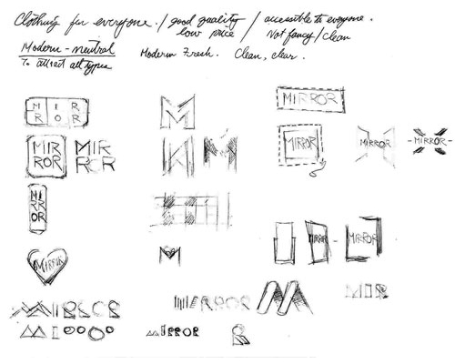
I started with logo explorations and gathered feedback.


I proceeded to generate a preliminary style guide for the visual language and feel of the website after choosing the logo.

The next step was creating a high fidelity responsive UI of the landing page along with a UI kit for reference.


I then built the high fidelity web pages for the prototype and testing using InVision.

I recruited five interviewees to test the website prototype, both in person or remote video chats.

I used an affinity map to organize critical findings.

Here are key discoveries from the interviews
Shipping fees and options are better communicated

I revised the taxes and shipping costs messages
